Our Logo

The Meaning Behind the Immaculate Homes Logo
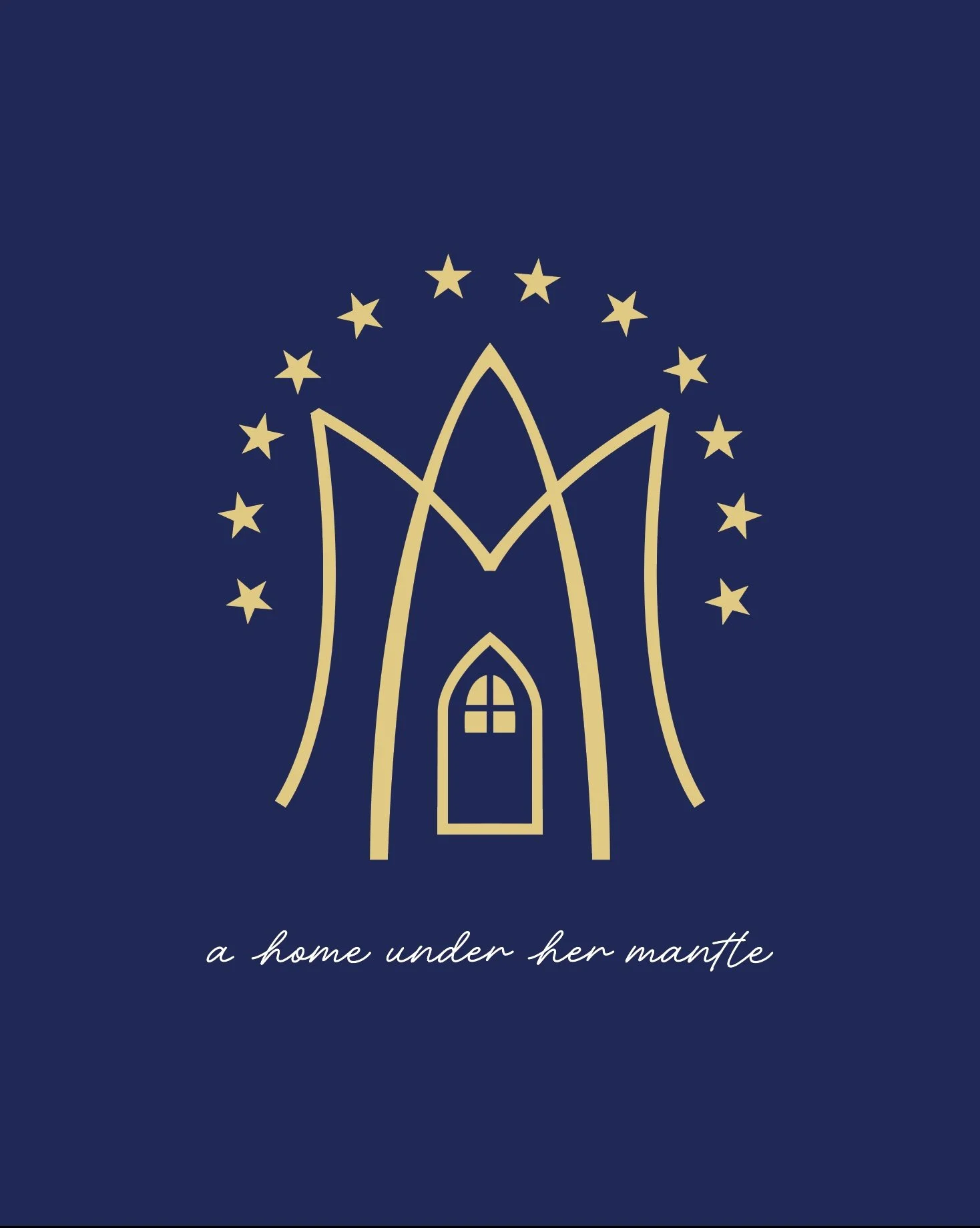
The Immaculate Homes logo was thoughtfully designed to represent the beauty of a home placed under the loving protection of the Blessed Virgin Mary. The flowing shape surrounding the home symbolizes Mary’s mantle, a traditional Catholic symbol of her maternal care, guidance, and protection over those entrusted to her.
At the center of the design is the home, representing more than a physical structure—it represents a place of love, faith, family, and belonging. The warm light shining through the windows reflects the belief that a home is truly alive when it is filled with joy, hope, and the light of Christ.
Above the home is the Auspice Maria (“Under the protection of Mary”) symbol, honoring Mary’s role as our spiritual mother and reminding us that every home is built best when founded on faith and grace. Surrounding the design are twelve stars, representing the crown of Mary described in Catholic tradition and her place as Queen of Heaven.
This image reflects our mission to bring the peace and joy found in Christ into every home, inviting His light to fill each space and His presence to remain at the heart of family life. The colors of the logo further express this mission: blue, the color traditionally associated with Mary, represents her purity, faith, and protective mantle over our homes, while gold represents the light, glory, and love of Christ that we hope to bring into every family’s home. Together, these colors symbolize a home rooted in faith, guided by Mary, and illuminated by Christ’s presence.
a home under her mantle
·
a home under her mantle ·